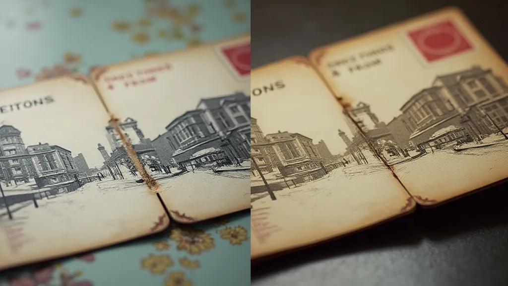
The Typographic Palette: Decoding the Font Styles of Vintage Postcards
There’s a peculiar magic in holding a vintage postcard. It's more than just a faded image of a long-gone street corner or a scenic vista; it’s a tangible link to a time when human connection travelled at a slower, more deliberate pace. For me, the allure isn’s solely about the image itself. It’s the *words*, and crucially, *how* they’re presented – the typography. Each font choice whispers stories about design trends, technological limitations, and the very people who hoped that small card would brighten someone's day.
My fascination began with my grandmother’s collection. She wasn't a serious collector in the philatelic sense; her postcards were more about sentimental value – memories of family vacations and correspondence with distant relatives. As a child, I was captivated by the images, but as I grew older, I began to notice the fonts. They weren't just “writing,” they were little works of art, reflecting the design sensibilities of a different era.
Early Printing & the Rise of Display Fonts
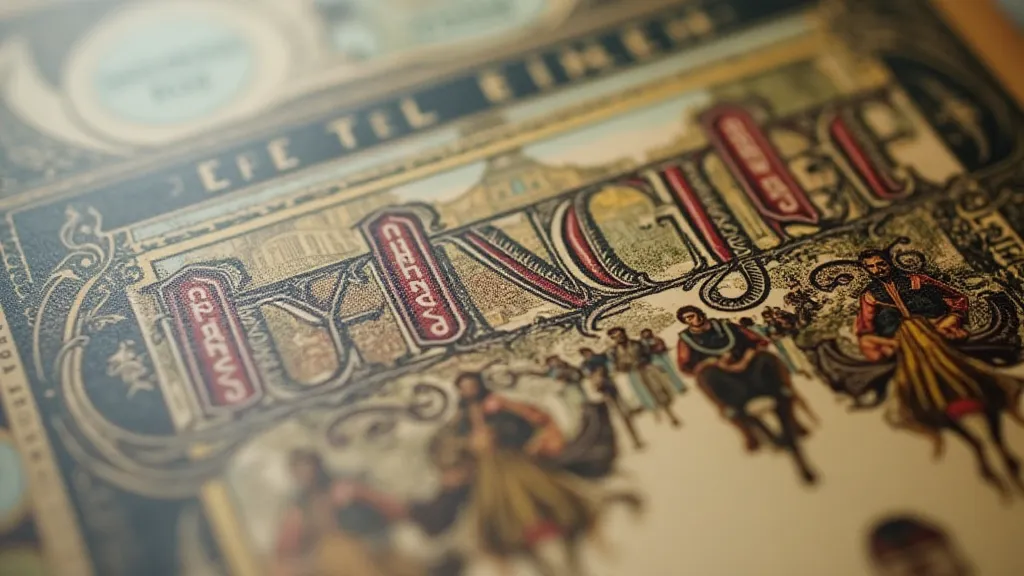
Before the mid-19th century, most printed materials, including early postcards, were produced using typeset fonts – elegant, but limited. The arrival of lithography changed everything. It opened the door for “display fonts,” designs specifically created to be visually striking and decorative. These weren't the standard, practical fonts used for books; they were meant to *grab* attention. Think of the exuberant “Greetings From…” cards that flooded the market. They weren’t subtle; they were declarations of place and personality. These early display fonts often mirrored popular art styles – Art Nouveau with its flowing lines and organic forms, or the bolder, more geometric styles of the Edwardian era.
The quality of these early prints was also heavily influenced by the technology available. Printers were constrained by the number of fonts they could afford – expensive to purchase and maintain. This meant that a single font might be used for multiple purposes, lending a certain uniformity to postcard designs. And imperfections were common. Ink smudges, misaligned lettering – these weren't flaws; they were hallmarks of a handmade process, adding character and a sense of authenticity to each card.
The Impact of the Linotype & “Modern” Design
The introduction of the Linotype machine in the late 19th century revolutionized printing. It allowed printers to set type much faster, making a wider range of fonts more accessible. Suddenly, bolder, more simplified designs began to emerge, influenced by the burgeoning "Modern" movement in art and design. These fonts were often geometric – think of the clean lines of Futura or the condensed forms of other sans-serif styles. While the earlier, ornate fonts felt romantic and nostalgic, these modern fonts signaled progress, efficiency, and a move towards a more streamlined future.
It’s fascinating to observe how these design trends were adopted and adapted for the postcard format. The elaborate curves and flourishes of the earlier styles were gradually replaced by straighter lines and a more minimalist aesthetic. Even the layout changed, with a greater emphasis on clear communication and visual impact. It wasn’t necessarily about abandoning the past, but about embracing the potential of the present.
Understanding the Audience & Regional Variations
The typography chosen for a postcard wasn’t solely dictated by aesthetic trends; it was also driven by the intended audience. Postcards aimed at a younger demographic, for example, might feature bolder, more playful fonts. Cards targeted at a more conservative audience might opt for a more traditional, serif-based design. And regional variations were significant. Coastal towns often showcased whimsical fonts evoking a sense of leisure and relaxation, while industrial centers might feature more robust, utilitarian styles.
I remember finding a collection of postcards from a small town in Pennsylvania. The fonts used were surprisingly uniform – simple, practical, and decidedly unglamorous. It spoke volumes about the values and aspirations of the community. These weren’t tourist postcards meant to impress; they were honest portrayals of everyday life.
Restoration & Collecting: The Font as a Clue
For collectors of vintage postcards, the typography can be more than just an aesthetic detail; it can be a crucial piece of the puzzle. The font used can often help to pinpoint the era the postcard was printed and even identify the printer or publisher. Researching font families and comparing them to known printing practices can provide valuable insights into a card's history.
Restoration is another area where typography plays a significant role. When attempting to repair a damaged postcard, it’s important to be mindful of the original font style. Simply filling in missing letters with a modern font can detract from the card’s authenticity. Careful observation and accurate reproduction are key to preserving the postcard’s original character.
Sometimes, a faded or damaged font can present a challenge to the eye. But I find a particular beauty in these imperfections. They tell a story of time and wear, of journeys undertaken and messages sent. They remind us that these postcards were once cherished objects, passed from hand to hand, carrying hopes, dreams, and memories across distances.
The Enduring Legacy of the Typographic Palette
Collecting vintage postcards isn’t just about accumulating pretty pictures. It’s about connecting with the past, about understanding the cultural and technological forces that shaped our world. And for me, the typography is the key to unlocking that understanding. Each font choice is a testament to the creativity and ingenuity of the people who brought these little pieces of history to life.
The next time you hold a vintage postcard, take a moment to appreciate the typography. Consider the design trends, the technological limitations, and the intended audience. You might be surprised at what you discover. You're not just looking at a font; you’re looking at a window into the past, a glimpse into the lives of those who came before us. It’s a rich and rewarding experience, and one that I wouldn’t trade for anything.